Skip to content
Learn
Frequently Asked Questions
Workplace Retirement Plan FAQ
VEBA/115 Trust, 401(h), & HRA FAQs
Health Savings Account FAQs
HSA & Medicare FAQs
Flexible Spending Accounts (FSA) FAQs
BPAS ClaimFinder FAQs
Roth FAQs
Investment FAQs
Retirement Account Topics
Workplace Retirement Plans: 401(k), 403(b), and more
Defined Benefit (Pension) and Cash Balance Plans
Individual Retirement Accounts (IRA)
Health Savings & Reimbursement Accounts
Health Savings Accounts (HSA)
VEBA/115 Trust, 401(h), and HRA
Flexible Spending Accounts (FSA) and Dependent Care Assistance Plans (DCAP)
BPAS ClaimFinder
Financial Wellness
Investment Concepts
Retirement Planning
Understanding Social Security & Medicare
Webinars
Planning
Risk Tolerance Quiz
Financial Calculators
Consolidating Retirement Accounts
Transferring an HSA into your Roadways HSA
IRS Cost of Living Adjustment Figures
Market Dashboard
Tax Documents
Español
Explorar
Preguntas Frecuentes
Temas sobre cuentas de retiro y ahorros
Salud Financiera
Conceptos de Inversión
Planificación de Retiro
Seguro Social y Medicare
Planificación
¿Qué Tipo de Inversionista es Usted?
Calculadoras Financieras
Consolidación de Cuentas de Retiro
Transferencia de un HSA
Ajustes del costo de vida del IRS
Tablero del mercado de valores
Documentos Fiscales
Conectar
Servicios para Participantes
Solicitar devolución de llamada
Enviar un mensaje seguro
Centro de ayuda para planificación
Del blog
Política de ciberseguridad
Formularios y enlaces
Aplicaciónes Móvil
Inicio de sesión de cuenta
Cuenta de retiro
Inicia sesión en tu cuenta
Configura tu cuenta en línea
Cuenta de HSA
Roadways HSA
BPAS HSA
Cuenta de VEBA o Fideicomiso 115
Cuenta de HRA o FSA
Cuenta de pensiones
Cuenta de COBRA
Connect
Participant Services
Request a Call Back
Send Us A Secure Message
Planning Help Center
From the Blog
Security Center
Forms and Links
BPAS Mobile Apps
Account Login
Retirement Plan
Login to Your Account
Setup Your Online Account
IRA
Setup Your Online Account
Login to Your Account
HSA
BPAS HSA
Roadways HSA
VEBA/115 Trust or 401(h)
HRA or FSA
DB Pension Plan
COBRA
Call 1-866-401-5272.
BPAS University
Learn
Frequently Asked Questions
Workplace Retirement Plan FAQ
VEBA/115 Trust, 401(h), & HRA FAQs
Health Savings Account FAQs
HSA & Medicare FAQs
Flexible Spending Accounts (FSA) FAQs
BPAS ClaimFinder FAQs
Roth FAQs
Investment FAQs
Retirement Account Topics
Workplace Retirement Plans: 401(k), 403(b), and more
Defined Benefit (Pension) and Cash Balance Plans
Individual Retirement Accounts (IRA)
Health Savings & Reimbursement Accounts
Health Savings Accounts (HSA)
VEBA/115 Trust, 401(h), and HRA
Flexible Spending Accounts (FSA) and Dependent Care Assistance Plans (DCAP)
BPAS ClaimFinder
Financial Wellness
Investment Concepts
Retirement Planning
Understanding Social Security & Medicare
Webinars
Planning
Risk Tolerance Quiz
Financial Calculators
Consolidating Retirement Accounts
Transferring an HSA into your Roadways HSA
IRS Cost of Living Adjustment Figures
Market Dashboard
Tax Documents
Español
Explorar
Preguntas Frecuentes
Temas sobre cuentas de retiro y ahorros
Salud Financiera
Conceptos de Inversión
Planificación de Retiro
Seguro Social y Medicare
Planificación
¿Qué Tipo de Inversionista es Usted?
Calculadoras Financieras
Consolidación de Cuentas de Retiro
Transferencia de un HSA
Ajustes del costo de vida del IRS
Tablero del mercado de valores
Documentos Fiscales
Conectar
Servicios para Participantes
Solicitar devolución de llamada
Enviar un mensaje seguro
Centro de ayuda para planificación
Del blog
Política de ciberseguridad
Formularios y enlaces
Aplicaciónes Móvil
Inicio de sesión de cuenta
Cuenta de retiro
Inicia sesión en tu cuenta
Configura tu cuenta en línea
Cuenta de HSA
Roadways HSA
BPAS HSA
Cuenta de VEBA o Fideicomiso 115
Cuenta de HRA o FSA
Cuenta de pensiones
Cuenta de COBRA
Connect
Participant Services
Request a Call Back
Send Us A Secure Message
Planning Help Center
From the Blog
Security Center
Forms and Links
BPAS Mobile Apps
Account Login
Retirement Plan
Login to Your Account
Setup Your Online Account
IRA
Setup Your Online Account
Login to Your Account
HSA
BPAS HSA
Roadways HSA
VEBA/115 Trust or 401(h)
HRA or FSA
DB Pension Plan
COBRA
Search for:
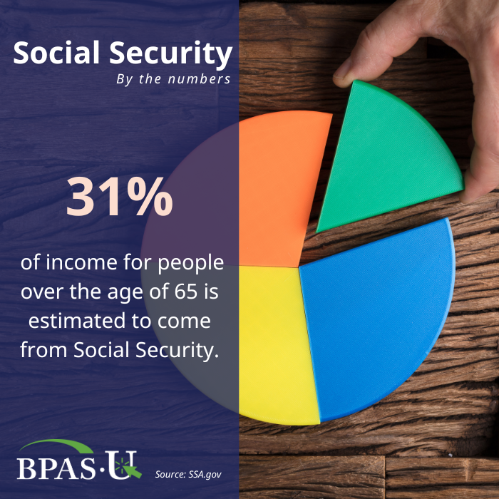
Social Security by the Numbers
Information
Catetory:
Social Security
Related gallery
Social Security by the Numbers
Social Security by the Numbers
Social Security by the Numbers